William Playfair, Florence Nightingale, Charles Joseph Minard
demography

|
Infographics
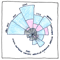
William Playfair created statistical graphics— the line graph, the bar chart, the pie chart, and the circle graph— to show economic data. * Florence Nightingale used polar area diagrams to persuade Queen Victoria and the parliament that lives could have been saved by improving sanitation in military hospitals. * Charles Joseph Minard visualized Napoleon’s losses during his disasterous Russian campaign in relation to time, distance, temperature, and direction of travel.
The graphic language
The graphic language had to be invented. How to understand data and show it graphically required synthesizing left-brain and right-brain processes—but it can be taught.
Coxcombs
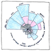
Queen Victoria and the parliament, not being trained statisticians, could understand Nightingale’s diagrams, which she called “coxcombs.” Coxcombs are caps of court jesters, conceited dandies, the red combs of cocks, or what looks like them. Looks like we kill more of our own soldiers than the enemy kills. Maybe we should do something about it. Otherwise, we might be coxcombs.


A.K.A. data visualization, descriptive statistics, or statistical graphics, forms include line charts, bar charts, circle graphs, histograms, scatter plots and biplots, box plots, pareto charts, pie charts and doughnut charts, ring or sunburst charts, control charts, run charts, step-and-leaf displays, cartograms, trellis charts (also called small multiples, lattice charts, grid charts, and panel charts), probability plots, spaghetti plots, residual plots, and block plots. Polar area diagrams are also called rose diagrams; almost no one calls them coxcombs any more.
Another noted statistical artist was John Snow, whose map of cholera clusters in London in 1854 helped save lives.
See also in The book of science:
Readings in wikipedia: